Select Your Region
Region-Based Optimized Content
How to Create a Next.js Components Global Library for Multiple Projects
Learn how to build a reusable Next.js components global library for multiple projects. Improve efficiency, consistency, and scalability across your applications with RW Infotech’s step-by-step guide.

Jaswinder Singh
In the fast-paced world of web development, efficiency and consistency are paramount. As projects scale and teams grow, the need for reusable code becomes critical. For Next.js developers, this often translates into creating a global component library—a centralized repository of UI elements that can be seamlessly integrated across various applications. This approach not only accelerates development cycles but also ensures a uniform user experience and simplifies maintenance.
This guide will walk you through the process of establishing a robust, reusable Next.js component library. We'll cover everything from structuring your library and crafting versatile components to configuring it for effortless integration into multiple projects. By adopting these strategies, you'll enhance modularity, boost scalability, and maintain impeccable code quality across all your Next.js endeavors, ultimately saving valuable time and streamlining your development workflow.
The Foundation: Understanding Component Libraries and Their Value
A component library is more than just a collection of UI elements; it's a strategic asset that embodies your design system and accelerates development. At its core, it's a set of pre-built, tested, and documented UI components (buttons, cards, forms, navigation elements, etc.) that can be shared and reused across different applications or even different teams within an organization.
Why Invest in a Global Component Library?
Consistency: Ensures a consistent look, feel, and behavior across all your applications, reinforcing brand identity and improving user experience.
Efficiency: Developers don't need to rebuild common UI elements from scratch, significantly speeding up development time. This is a cornerstone of modern Jamstack website development, where speed and reusability are key.
Maintainability: Updates or bug fixes to a component only need to be applied in one place (the library), and then propagated to all consuming projects, reducing the risk of inconsistencies.
Scalability: As your product suite grows, a well-structured component library makes it easier to onboard new developers and scale your development efforts.
Collaboration: Fosters better collaboration between design and development teams by providing a shared language and a single source of truth for UI elements.
Performance Optimization: By ensuring consistent, well-optimized components, you can inherently improve the overall performance of your applications.
Architecting Your Next.js Global Component Library
Creating a global component library requires careful planning regarding structure, tooling, and distribution. We'll explore two primary architectural patterns: a monorepo approach and a separate package approach.
Monorepo vs. Separate Package: Choosing Your Strategy
When building a global component library, the first critical decision is how to manage its relationship with your consuming applications. Each approach has distinct advantages:
Monorepo Architecture (e.g., Lerna, Nx, Turborepo)
In a monorepo, your component library lives alongside your Next.js applications in a single Git repository. Tools like Lerna, Nx, or Turborepo help manage the various packages within this monorepo.
Pros:
Simplified Development: Easier to make changes across the library and consuming applications simultaneously, as all code is in one place.
Atomic Commits: Changes affecting both the library and an application can be committed together.
Shared Tooling: Centralized configuration for linting, testing, and building.
Local Testing: Components can be tested directly within the monorepo against consuming applications without publishing.
Cons:
Complexity: Can become complex to manage as the number of packages grows.
Build Times: Full builds can be slower, though modern monorepo tools mitigate this with caching.
Tooling Overhead: Requires learning and configuring monorepo-specific tools.
Separate Package Architecture (NPM Package)
In this approach, your component library is a standalone project, published as an NPM package (or private package) and consumed by your Next.js applications like any other third-party dependency.
Pros:
Clear Separation of Concerns: The library is a distinct entity, promoting better modularity.
Version Control: Explicit versioning of the library allows consuming projects to upgrade at their own pace.
Simpler Project Structure: Each project maintains its own isolated environment.
Wider Reusability: Can be easily consumed by any project, not just those in a specific monorepo.
Cons:
Publishing Overhead: Requires publishing to NPM (or a private registry) for every update.
Local Development Challenges: Requires linking or installing local versions for testing changes across the library and consuming apps.
Version Drift: Consuming projects might fall behind on library updates.
For most organizations looking to truly create a global library for multiple projects that might not all live in the same monorepo, the separate package approach often offers greater flexibility and clearer version management, especially for headless CMS migrations where the frontend might be split across multiple teams or even technologies.
Setting Up Your Component Library Project
Let's proceed with setting up a separate package for our Next.js component library. This ensures maximum reusability and version control.
1. Initialize Your Library Project
Create a new directory for your library and initialize it as a Node.js package:
mkdir my-nextjs-ui-library
cd my-nextjs-ui-library
npm init -y2. Install Core Dependencies
You'll need React and Next.js-specific dependencies if your components rely on Next.js features like Image or Link. For pure UI components, React and Styled Components (or Tailwind CSS, Emotion, etc.) are sufficient.
npm install react react-dom next
npm install --save-dev typescript @types/react @types/react-domIf you're using a styling library like Styled Components:
npm install styled-components
npm install --save-dev @types/styled-components3. Configure TypeScript
Create a tsconfig.json at the root of your library. This configuration is crucial for type checking and compiling your components.
{
  "compilerOptions": {
    "target": "es5",
    "lib": ["dom", "dom.iterable", "esnext"],
    "allowJs": true,
    "skipLibCheck": true,
    "esModuleInterop": true,
    "allowSyntheticDefaultImports": true,
    "strict": true,
    "forceConsistentCasingInFileNames": true,
    "noFallthroughCasesInSwitch": true,
    "module": "esnext",
    "moduleResolution": "node",
    "resolveJsonModule": true,
    "isolatedModules": true,
    "jsx": "react-jsx",
    "declaration": true,
    "outDir": "./dist"
  },
  "include": ["src"],
  "exclude": ["node_modules", "dist"]
}4. Structure Your Components
A well-organized src directory is essential. Each component should ideally reside in its own folder, containing the component file, its styles, and its types.
my-nextjs-ui-library/
├── dist/
├── node_modules/
├── src/
│   ├── components/
│   │   ├── Button/
│   │   │   ├── Button.tsx
│   │   │   ├── Button.styles.ts
│   │   │   └── index.ts
│   │   ├── Card/
│   │   │   ├── Card.tsx
│   │   │   └── index.ts
│   │   └── ...
│   ├── hooks/
│   ├── utils/
│   ├── types/
│   └── index.ts
├── package.json
├── tsconfig.json
5. Create Your First Reusable Component (Example: Button)
src/components/Button/Button.styles.ts:
import styled, { css } from 'styled-components';
interface StyledButtonProps {
variant?: 'primary' | 'secondary' | 'ghost';
size?: 'small' | 'medium' | 'large';
fullWidth?: boolean;
}
const getVariantStyles = (variant: StyledButtonProps['variant']) => {
switch (variant) {
case 'secondary':
return css`
background-color: #6c757d;
color: white;
&:hover {
background-color: #5a6268;
}
`;
case 'ghost':
return css`
background-color: transparent;
color: #007bff;
border: 1px solid #007bff;
&:hover {
background-color: rgba(0, 123, 255, 0.1);
}
`;
case 'primary':
default:
return css`
background-color: #007bff;
color: white;
&:hover {
background-color: #0056b3;
}
`;
}
};
const getSizeStyles = (size: StyledButtonProps['size']) => {
switch (size) {
case 'small':
return css`
padding: 0.5rem 1rem;
font-size: 0.875rem;
`;
case 'large':
return css`
padding: 1rem 2rem;
font-size: 1.25rem;
`;
case 'medium':
default:
return css`
padding: 0.75rem 1.5rem;
font-size: 1rem;
`;
}
};
export const StyledButton = styled.button<StyledButtonProps>`
border: none;
border-radius: 0.25rem;
cursor: pointer;
transition: background-color 0.2s ease-in-out;
${({ variant }) => getVariantStyles(variant)}
${({ size }) => getSizeStyles(size)}
${({ fullWidth }) => fullWidth && css``}
`;src/components/Button/Button.tsx:
import React from 'react';
import { StyledButton } from './Button.styles';

export interface ButtonProps extends React.ButtonHTMLAttributes<HTMLButtonElement> {
  variant?: 'primary' | 'secondary' | 'ghost';
  size?: 'small' | 'medium' | 'large';
  fullWidth?: boolean;
  children: React.ReactNode;
}

export const Button: React.FC<ButtonProps> = ({
  variant = 'primary',
  size = 'medium',
  fullWidth = false,
  children,
  ...props
}) => {
  return (
    <StyledButton variant={variant} size={size} fullWidth={fullWidth} {...props}>
      {children}
    </StyledButton>
  );
};src/components/Button/index.ts:
export * from './Button';6. Create the Main Entry Point
The src/index.ts file will be the main entry point for your library, exporting all the components you want to make available.
// src/index.ts
export * from './components/Button';
// export * from './components/Card';
// export * from './hooks/useCustomHook';
Building and Publishing Your Library
Once your components are ready, you need to compile them into a distributable format and publish them.
1. Configure package.json for Publishing
Update your package.json with crucial fields for distribution:
name: Your package name (e.g.,@my-org/ui-library).version: Semantic versioning (e.g.,1.0.0).main: The CommonJS entry point (e.g.,dist/index.js).module: The ES Module entry point (e.g.,dist/index.mjs).types: The TypeScript declaration file (e.g.,dist/index.d.ts).files: An array of files/directories to include when publishing.scripts: Build command.
{
  "name": "@rwinfotech/nextjs-ui-library",
  "version": "1.0.0",
  "description": "A global UI component library for Next.js projects by RW Infotech.",
  "main": "dist/index.js",
  "module": "dist/index.mjs",
  "types": "dist/index.d.ts",
  "files": ["dist"],
  "scripts": {
    "build": "rm -rf dist && tsc && tsc --module ESNext --outDir dist/esm --declaration false && mv dist/esm/index.js dist/index.mjs",
    "prepare": "npm run build",
    "test": "echo \"Error: no test specified\" && exit 1"
  },
  "keywords": [
    "nextjs",
    "react",
    "ui-library",
    "components",
    "headless",
    "jamstack"
  ],
  "author": "RW Infotech",
  "license": "MIT",
  "peerDependencies": {
    "react": ">=17.0.0",
    "react-dom": ">=17.0.0",
    "next": ">=12.0.0"
  },
  "devDependencies": {
    "@types/react": "^18.2.0",
    "@types/react-dom": "^18.2.0",
    "@types/styled-components": "^5.1.26",
    "next": "^14.0.0",
    "react": "^18.2.0",
    "react-dom": "^18.2.0",
    "styled-components": "^6.0.0",
    "typescript": "^5.0.0"
  }
}Note: peerDependencies indicate that your library expects the consuming project to provide these dependencies, preventing duplicate React instances and reducing bundle size.
2. Build Your Library
npm run build
This will create the dist directory with your compiled JavaScript files and TypeScript declaration files.
3. Publish to NPM
Before publishing, ensure you're logged into NPM (npm login). Then, publish your package:
npm publish --access publicUse --access public for public packages. For private packages within an organization, configure a private NPM registry or use npm publish without the flag if your .npmrc is set up for a private scope.
Consuming Your Global Library in Next.js Projects
Now that your library is published, consuming it in any Next.js project is straightforward.
1. Install the Library
npm install @rwinfotech/nextjs-ui-library2. Use Your Components
// pages/index.tsx or any component file
import { Button } from '@rwinfotech/nextjs-ui-library';
import styled from 'styled-components';

const Container = styled.div`
  padding: 2rem;
  text-align: center;
`;

export default function Home() {
  return (
    <Container>
      <h1>Welcome to My Next.js App</h1>
      <p>Using components from our global library:</p>
      <Button onClick={() => alert('Primary clicked!')}>Primary Button</Button>
      <Button variant="secondary" size="large" style={{ marginLeft: '1rem' }}>
        Secondary Large
      </Button>
      <Button variant="ghost" size="small" fullWidth style={{ marginTop: '1rem' }}>
        Ghost Small Full Width
      </Button>
    </Container>
  );
}
Note: If your library uses Styled Components, ensure your Next.js project is also configured to use Styled Components (e.g., with a _document.tsx setup for server-side rendering).


Hi, my name is Jaswinder, let's talk about your business needs.
I will do my best to find a reliable solution for you!
Best Practices for a Sustainable Component Library
Building a library is one thing; maintaining and evolving it is another. Here are key best practices:
Documentation (Storybook, Styleguidist): Comprehensive documentation is non-negotiable. Tools like Storybook allow you to develop, test, and document components in isolation, serving as a living style guide.
Versioning (Semantic Versioning): Use semantic versioning (Major.Minor.Patch) to clearly communicate changes.
Testing (Unit, Integration, Visual Regression): Implement robust testing for components, interactions, and UI regressions.
Accessibility: Design components with accessibility in mind from the start.
Theming & Customization: Design components to be easily customizable via props, CSS variables, or a theming system.
Tree Shaking: Ensure consuming applications only bundle components they use.
Contribution Guidelines: Establish clear guidelines for developers contributing to the library.
Automated CI/CD: Automate testing, building, and publishing for speed and quality, especially in modern AI-driven development workflows.
Conclusion
Creating a global component library for Next.js projects is a strategic investment that pays dividends in consistency, efficiency, and scalability. By centralizing your UI elements, you empower your development teams to build faster, maintain higher code quality, and deliver a cohesive user experience across your entire product suite. The initial effort in setting up the infrastructure, tooling, and best practices is quickly recouped through accelerated development cycles and reduced technical debt.
At RW Infotech, we understand the complexities of modern web development and the critical role of robust component libraries in building high-performing applications. Whether you're embarking on a headless solution, optimizing for performance, or integrating AI automation, a well-crafted global component library is foundational. Our expertise in full-stack development and Jamstack architectures allows us to design, develop, and implement custom component libraries that perfectly align with your business goals, ensuring your Next.js projects are not just functional, but future-proof and incredibly efficient.
Frequently Asked Questions
Find answers to the most common questions about Next.js components global library.
A Next.js components global library is a centralized collection of reusable UI components built specifically for Next.js projects. It allows developers to maintain consistency, speed up development, and easily share components across multiple projects.
Creating a global library ensures consistency, maintainability, and scalability across applications. It reduces duplicated code, accelerates development, and allows teams to collaborate efficiently.
It depends on your workflow:
Monorepo: Easier for managing library and projects together; good for internal teams.
Separate package: Better for independent versioning and sharing across multiple projects, especially in large organizations.
Yes, by isolating styles. Use CSS-in-JS (Styled Components, Emotion) or utility-first frameworks like Tailwind CSS with proper scoping to avoid conflicts.
Compile your library with TypeScript or a bundler, then publish to NPM (public or private). Use peerDependencies for React/Next.js to avoid duplicate instances in consuming projects.
News & Insights
We like to share our thoughts on topics we find inspiring. Explore our news and insights.

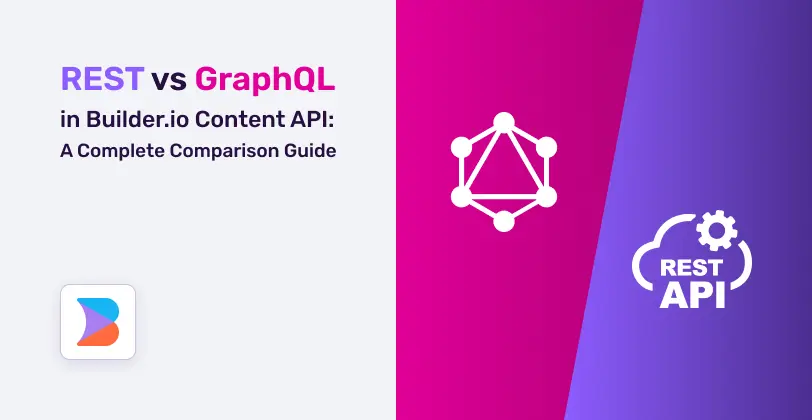
REST vs GraphQL in Builder.io Content API: A Complete Comparison Guide
A complete comparison guide to REST vs GraphQL in Builder.io Content API. Learn performance differences, caching strategies, developer experience, real-world use cases, and how to choose the right API approach for scalable, high-performance digital experiences.


How to Build Advanced AI Marketing Reporting Systems with Sanity Content Lake
Learn how to build advanced AI marketing reporting systems using Sanity Content Lake. This guide explains how to centralize marketing data, integrate AI-powered analytics, generate real-time insights, build predictive models, and create dynamic dashboards that help marketing teams optimize campaigns, improve decision-making, and maximize ROI.