Select Your Region
Region-Based Optimized Content
Mobile SEO Stacking: Guide to pace up with mobile first indexing
Learn how to adapt your website for Google's mobile-first indexing. Get tips on mobile SEO stacking, speed optimization, and improving mobile user experience for better rankings

Anupama Sharma

Just a few years back the only usage of the phone was to make calls and having a cell phone was a luxury that only riches could afford. Within a span of such a short period, the usage of the cell phone has taken a drastic turn when the internet got introduced to phones. Everything from cameras to personal computers got integrated into smartphones and we were able to get hold of the whole world from anywhere, anytime.
An announcement made by Google broadcasted that most people use the internet through smartphones and even Hitwise confirmed Google's announcement saying that 60% of the users use the internet through phones. Most people were using Google on their mobile devices, but Google’s ranking systems were based around the desktop.
For Google gave a solution by introducing "Mobile-first indexing", which in the course changed the world. We’re never going back to the days of optimizing search for desktop only.

Also Read: Tips to Boost Sales by Image Optimization
This vast usage of phones to access the internet has encouraged developers to make it more efficient for Smartphone usage by introducing different operating systems like Android, IOS. These operating systems are built significantly to enhance the experience of Internet usage on phones. Due to high mobile usage across many industries amongst most of the countries, it's already critical to take mobile search behavior and optimization into consideration to establish a winning SEO strategy.
So in this Smartphone-oriented and Internet progressed world, We need to answer some questions and should get in depth that how things are changed for your site? As it turns out, there are many implications. You might have to make some serious changes if you want your Google ranking intact or if you want to crawl up in Google searches. We need to keep some key points and answers to some questions in your mind to hike business and to keep in pace.
What is the search behavior of your audience?
You need to get in depth with the data that what kinds of queries are seeking traffic towards your website. The mobile search share of these or any other terms you want to access and potentially target with your mobile web presence.


Hi, my name is Anupama, let's talk about your business needs.
I will do my best to find a reliable solution for you!
Is your site is as exquisite in mobile view as it is in desktop view?
Your site needs to be responsive. This is the most important point to even initiate the ranking and to do to rank well on the mobile-first indexing. Being responsive to a site means it changes its view according to the device i.e. it adapts itself according to the devices. We can also say that a mobile-friendly site will look the same on both desktop and mobile, but it will be designed for mobile.
Does your site loads swiftly?
You should always make it sure that your site load swiftly on both desktop and mobile view. Keep the constant track of your website's speed.
Optimize the content of your site according to smart phones
All the fields of your websites should be optimized in correspondence to the Smartphone. All the titles, Meta descriptions, headings, etc. should be correctly set and must be targeting the relevant queries.
It's really important to have a relevant mobile SEO staking in this Mobile first era. Most of the people use smart phones to access internet and sites. You should indulge your time and efforts to make your sites more mobile friendly. Google has introduced its Mobile first indexing, so make sure that you won't be left behind by not optimizing your sites for phones.
Don't let the lack of mobile optimization and not considering mobile first, snatch your costumers. If you focus now on making your mobile site great, you’ll be ranked better and would serve a better experience to your users.
News & Insights
We like to share our thoughts on topics we find inspiring. Explore our news and insights.
.png)
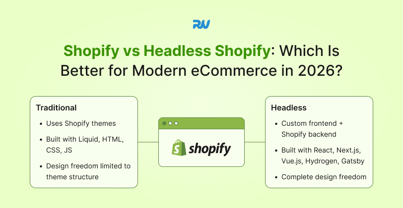
Shopify vs Headless Shopify: Which Is Better for Modern eCommerce in 2026?
A detailed comparison of Shopify vs Headless Shopify for modern eCommerce in 2026. Explore performance, scalability, customization, SEO, cost, and development complexity to choose the best platform architecture for your business growth.

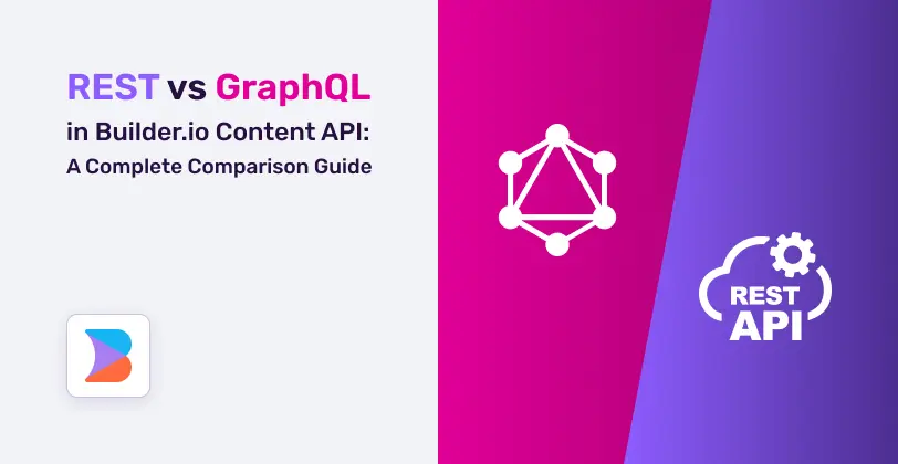
REST vs GraphQL in Builder.io Content API: A Complete Comparison Guide
A complete comparison guide to REST vs GraphQL in Builder.io Content API. Learn performance differences, caching strategies, developer experience, real-world use cases, and how to choose the right API approach for scalable, high-performance digital experiences.